


What Does a Website Product Owner Do?
The website product owners manage the digital experiences across a number of channels and address customers' needs to create valuable results for a company....

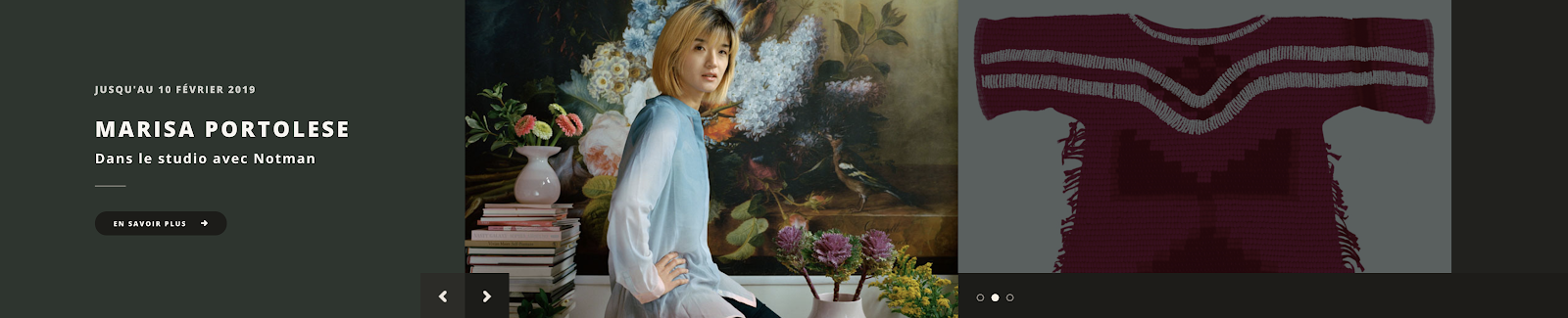
Hero banners are the first visual components that users see when landing on a website’s homepage. It is generally a large image that occupies a sizable screen estate featuring eye-catching statements, bold visual elements, and oftentimes imagery that reflects a location’s landscape, its people or special events or exhibitions.
From a business perspective, this visual component can serve as a way to attract users to the website, showcase a location’s appeal, and generate leads for new business acquisitions. From a user’s perspective, a hero banner is the first impression that they receive upon arrival, which in turn sets the tone and mood as they progress throughout the website.
For example, a user enters a website where immediately they see a fiery sun being orbited by planets in outer space or giant dinosaur skeletons looming over small children. In both examples, whether it is awe or excitement, these images set the tone and mood of the website giving the user their first impression.
Furthermore, by shifting the focus towards a user-centric approach this component can be most effective at conveying the organization’s brand and messaging, especially when paired with the right content and call-to-actions to help create a user experience that reflects the business' values and beliefs.
Slideshows are design components that enable users to view or cycle through items in sequential order. Generally, this component can be featured anywhere within a website, but it is more commonly displayed in a combination within a hero banner to highlight numerous topics, areas of importance or used to display photo galleries.
From a business perspective, slideshows allow the organization to feature many topics and points of interest within a defined space while adding a layer of interactivity to an otherwise static website.
This is meant to attract users and entice them to explore more of the website. However, overuse of this design component has been on the declining trend for the past 30 years, especially as user research has shown that oftentimes people are simply scrolling too fast to view more than just a few slides or are not even aware it is a slideshow because the arrow indicators are not visible enough to catch the users attention.
Not only can this component take up a large screen estate, but it can also prove to be distracting and in worse case scenarios act more as white noise for users as they attempt to complete their tasks.
However, by using this component as an element of storytelling and for showcasing a branded narrative with the right contents and call-to-actions, a modern take on slideshows can be an effective tool to expose users to a curative experience, especially when combined with best practices in design and coding.
Popularized by the rising emergence of Material Design by Google, the card component has seen a sharp increase in its usage across many web and mobile platforms that are not necessarily affiliated with Google products.
The card component itself is a means of organizing various data into sizeable chunks in order for the user to be able to quickly gain context of what that content is and what they can reasonably expect should they click on it.
Oftentimes cards are paired with imagery to further give the user context as to what the card entails. For example, if users are on an event page, cards can be used to display other related events and give the users valuable insight as to what each event entails with information such as a description, date, time, location, etc...
Card components are widely used because they are an effective way for information to be grouped, showcased and highlighted in an easy-to-digest manner. From a user perspective, it can also allow them to process information in bite-sized pieces, and be able to receive enough context to confidently proceed onto the next stage of their task.
Menus are navigational components that can contain drop-down elements triggered by the user as they hover over it, typically located at the top of the web page. Within this drop-down menu, it can contain lists of categories and potentially all of its individual sub-topics.
As a result, this method of showcasing a website’s navigation can easily contain large amounts of information that users must then parse through in order to find what they are looking for to complete their task.
For example, mega menus are best suited for sites that manage extensive volumes of products such as e-commerce, if the organization publishes and manages a vast amount of content such as news, or if the website is primarily information-oriented.
However, there is no one way to go about featuring a website’s menu - that is why approaching the menu navigation as an extension of the user experience can help to shift the focus to showcase the menu in a fun and creative manner that encourages users to explore other parts of the website.
From a business perspective, menus allow the organization to efficiently list, categorize, and display large volumes of topics into sections that users can locate and identify.
From a creative design perspective, menus can also be an opportunity to introduce playful, dynamic animations and imagery to fully immerse the user into the journey of exploring and discovering new and exciting adventures as they are exposed more to the brand.
In order for a menu to be successful, it will require the efforts and buy-in of all parties involved within the project from clients, stakeholders, designers, developers, marketers, and more.
At the end of the day the group that will be using this the most are in fact the users themselves, and creating the best possible tourism experience for the user can mean the difference between converting a visitor into a valuable use for the brand and business.
In addition, these scenarios and lessons can also be applied to a website’s footer navigation located at the bottom of the page, where every single link and resource is listed, thereby creating bloated navigation similar to their menu counterpart.
By keeping the menu and footer navigation as simple and clean as possible can mean the difference between a poor and great user experience as they complete tasks throughout the website.
Imageries are typically photos but they can also be in the form of custom illustrations, which are visual elements that are used on the website to help bring to life the content that is being displayed.
By carefully selecting the right images to be used on the website can truly make or break the user experience as the goal is to expose the user to the brand, message, personality, and tone.
As a result, imageries that are successful at conveying these nuances can help to immerse the user into the journey or conversely give the user the wrong or unintended impressions.
There are two main ways of going about finding the right images to be used within a website: stock photos or branded photos. There are many resources available online today to find the perfect stock images. However, users can easily spot a stock image due to its proliferation and widespread usage across many different websites and platforms.
As a result, users have been found to appreciate and respond more positively to images that have been branded versus utilization of stock photos.
This method can be quite costly as it requires additional resources to plan, produce and market these imageries versus purchasing a license.
However, if this is done properly branded images can have a significant impact that not only will users appreciate but can also help to strengthen and deepen the visual brand identity of an organization and distinguish themselves from their competitors.
In order to create impactful change, a website must shift its focus from a purely business mindset and move towards a user-centric approach.
By placing the user at the forefront will help to focus the efforts to truly understand what are some of the problems that currently exist today and how we as experts within our domain can help to solve these issues.
For example, levels of efforts can be placed on reviewing and reforming the existing information architecture of a website to determine what is and isn’t working, which labels are unclear and why, which topics are redundant or too ambiguous, or in extreme cases recognizing that a fresh start from the ground up may be necessary depending on the circumstances.
In addition, with today’s technology and capabilities, more people are continuing to browse and switch between desktop and mobile which will require websites to be more responsive and efficient at handling processing and displays of information and data.
The structure and layout must also be logical and have a consistent look and feel throughout the website or else it could undermine the user experience. Furthermore, having the clear, concise and strategic placement of call-to-actions will also significantly help to improve the user’s ability to complete tasks throughout the website.

Ryan Pelicos
Marketing Coordinator
Ryan is a passionate storyteller who thrives on challenging the status quo. He is an avid researcher with a keen analytical mind able to strategize on technology, sales and marketing decisions by analyzing data and behaviours across various industries and technologies.
What Does a Website Product Owner Do?
The website product owners manage the digital experiences across a number of channels and address customers' needs to create valuable results for a company....

7 Tips for Designing Great Website Navigation
In this article, we'll discuss 7 pro tips for designing great website navigation. So, let's get started!...

OPIN Launches Activate to Help Make Launching New Drupal Sites Easier, Faster and More Secure
OPIN, an award-winning Drupal digital communications agency, launched Activate today - the easiest way to set up and lau...
135 Laurier Ave. West, Suite 100
Ottawa, ON K1P 5J2
TEL: 1 (877) 257-6746
153 Regent Street
Saratoga Springs, NY 12866
TEL: 1 (877) 257-6746